It is estimated the average consumer spends less than a second scanning shelves before deciding what deserves attention.
Package design is not decoration. It is positioning.
Strong packaging helps products feel credible, recognizable and worth picking up. Typography, hierarchy, colour, structure and messaging all influence whether a product is noticed, trusted or ignored.
At Graphic a la Design, package design is created with branding, production, print accuracy and real-world retail visibility in mind. From labels and retail packaging to multilingual game production and product materials, every detail is designed to support both presentation and performance.
This portfolio features a small selection of package design projects created for businesses locally, nationally and internationally.
Package design is the first sales pitch.
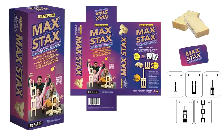
MaxStax Original – Tri-lingual packaging in English, French and Spanish was designed to make the game easy to understand quickly. Every graphic, colour choice and instruction panel was built to support retail visibility, gameplay clarity and international distribution.
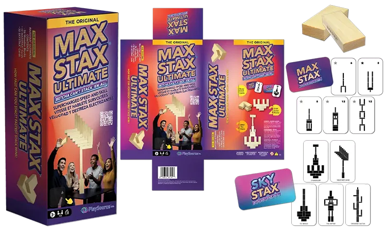
MaxStax Ultimate – Tri-lingual packaging positioned MAXSTAX™ Ultimate as the expanded combination of MAXSTAX™ and SKYSTAX™. The layout, messaging and visuals were intentionally designed to show more blocks, more play options and a bigger game experience.
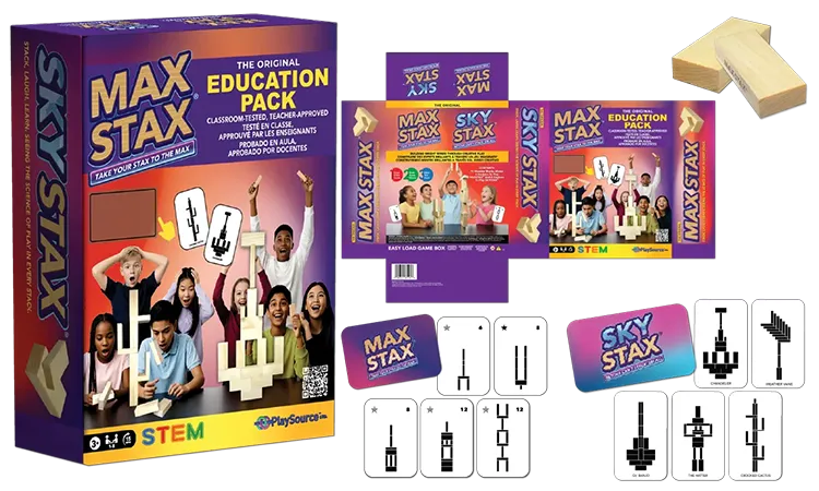
MaxStax Education Pack – Tri-lingual packaging used educator-focused language, STEM messaging and clear visual structure to connect with schools, teachers and parents. Every element was designed to make the classroom value easy to recognize.

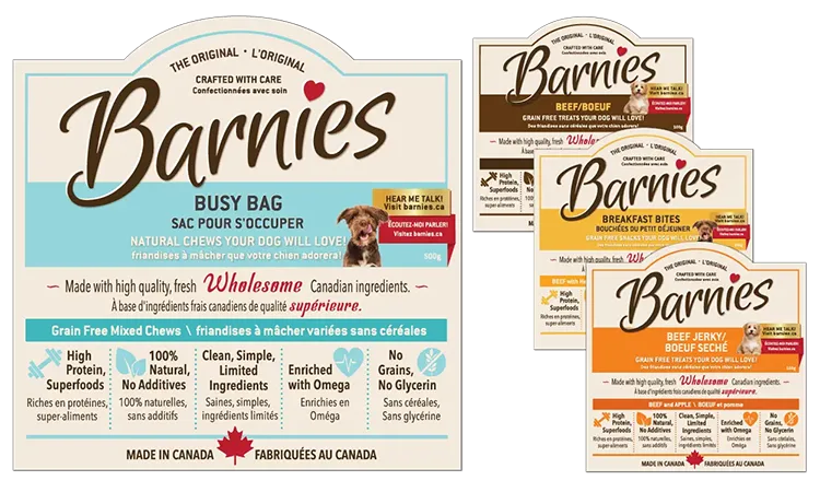
Barnies Packaging – Bilingual packaging in English and French was designed to clearly separate Barnies’ dog and cat products from its established horse product line. Colour, hierarchy and product messaging were used intentionally to make shopping easier.
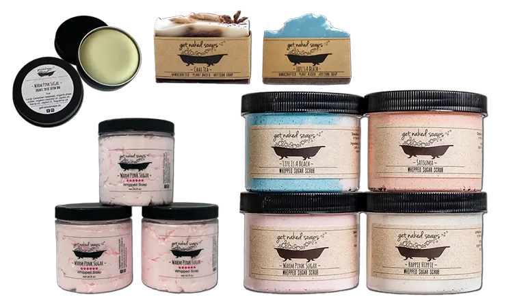
Get Naked Soap Labels – Bilingual labels in English and French used clean, minimal packaging to keep the product at the centre of attention. Typography, spacing and consistency were designed to make the line feel natural, trusted and easy to shop.
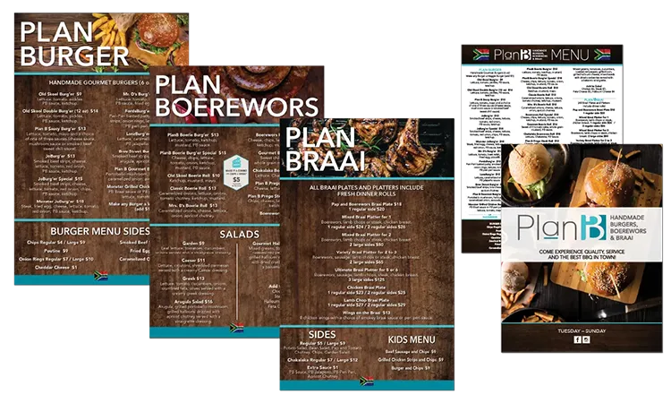
Plan B Menu Wall Boards – Oversized menu boards were designed with clear categories, readable typography and strong visual organization. The goal was to help customers make faster ordering decisions while keeping the restaurant branding consistent.

Merithian Product – Tri-lingual packaging in English, French and Spanish was designed to organize safety details, product steps and technical information clearly. Every panel was built for readability, retail impact and production accuracy.
Graphic a la Design creates package design built to move from concept to shelf with consistency, accuracy and production-ready execution.
The right package design protects the product, positions the brand and helps customers decide faster.
© Portfolio samples shown throughout this website represent a small selection of Lori Thompson’s graphic design, website design and branding work through Graphic a la Design. Due to contractual restrictions with some corporate and trade clients, not all projects may be publicly displayed. Additional work samples may be viewed on Graphic a la Design’s social media platforms or in person by appointment. Please respect Canadian Intellectual Property and Copyright Laws by not reproducing, copying or using the work of Graphic a la Design without written permission from Lori Thompson.